Summary

Summary

Summary

The Problem

Overwhelmed millennial homeowners need a streamlined, trustworthy platform to stay informed about their projects.

The Solution

HomeBio is a home service platform that helps users track and manage their home maintenance projects while keeping them informed using a convenient chat tool and project dashboard.

The Process

1. Research

Domain Research, Competitive Analysis, Survey, User Interviews

2. Define

Problem Statement, Design Principles, Persona

3. Ideate

Journey Map, Low-fidelity Wireframes, Concept Testing, Priority Matrix

4. Prototype + Test

Site Map, Mid-fidelity Prototype, Usability Testing

5. Outcome

Annotated Wireframes, High-fidelity Wireframes

Back To Top
UX/UI

HomeBio

Mock Client

Our stakeholders are looking to tap into the billion-dollar home services industry by becoming the “Uber of home service solutions.” They want to take advantage of the trend of “on-demand” apps and apply it to home services.

Project Brief

Design a one-stop solution for finding, reviewing, bidding, scheduling, and paying for home service requests.

Target Audience

Millennial homeowners and renters

Team

4 UX Designers

Gotta Run?

The Current
Domain

The Current Domain

The Current Domain

The Current
Domain

Going into our research we knew we needed to gain an understanding of both the current market and our target audience.

Research Objectives

Using our project brief as a starting point, we aimed to learn the following information from our research.

  1. How current competitors are addressing user needs

  2. Users’ pain points when hiring home service professionals

  3. Features users need on home service hiring platforms

  4. Qualities users look for when hiring home service professionals.

Examining competitors

From our preliminary research we found that the on-demand home service market was extremely saturated, with platforms offering a wide range of services and features. In order to make sense of this, we compared a few of the most prominent platforms in the industry then identified areas of opportunity we can explore further.

Full Feature Integration

As can be seen in this comparison chart, all competitors were missing at least one of the features our stakeholders were looking to incorporate into their platform. This gives us an opportunity to differentiate our solution from the market.

Trustworthiness and transparency

Many of the platforms we analyzed claimed to have some sort of vetting or verification process but were vague on any specifics upfront. We found that transparency on the vetting of professionals was a weak spot overall for competitors.

Understanding the Users

Based on the opportunities we identified in the market, we learn more about what users thought of the features we were considering and how they define transparency and trustworthiness when it comes to home services. To get a better understanding, we conducted a survey and user interviews.

User Interviews

10

Participants

Survey

54

Respondents

Through this we were able to pull insights that provide more context for our initial findings and identify user needs.

  • Users lack familiarity and knowledge about the space

    We found there’s a lack of knowledge about on-demand home services in general. This makes each experience in hiring a professional difficult and complicated.

  • Users need accountability and transparency

    Users had frustrations with the lack of accountability on on-demand platforms even when those platforms had claims of vetting listed professionals.

  • Users need hiring platforms to be easy and simple

    Users felt overwhelmed by on-demand platforms and felt they only further complicated the process. As one user said, “Apps are too complicated, just another middle man.”

  • Users rely on their trusted contacts for recommendations

    Users prefer to find professionals through their family or friends because it feels more trustworthy. When that isn’t available they’ll look at online reviews but with a grain of salt. The same skepticism is felt toward paid referral systems.

  • Users value responsive and honest communication

    We found that honest and responsive communication builds trust between the user and the professional and platform. Users prefer to know the honest details of a project and feel it makes the professional look more competent and trustworthy.

Focus Shift

Our research findings show that although millennials are known to champion platforms that do it all and do it fast, when it comes to something as personal and potentially risky as home services, they value quality of the platform over the quantity of features.

Moving forward we knew in order to design a high quality solution for our user, we would need to focus on how to effectively satisfy the user needs rather than the features specified in our project brief.

Defining the Problem

Defining the
Problem

Defining the Problem

Defining the
Problem

To reinforce our shift in focus, we synthesized our research into artifacts that could guide our solution.

Our Primary User

To narrow down our target audience further, we created a persona for our primary user based on our research.

Peter, 37

Peter, 37

Owns a 3-bedroom condo with his partner

Has limited DIY experience and average experience hiring

Goals
  • Maintain his home’s value

  • Prevent stressful emergency repairs

  • Get trusted advice and recommendations from family and friends

Frustrations
  • Overwhelmed by unfamiliarity with the needs of his home

  • Worries whether work is being done correctly or competently if a contractor doesn’t communicate details of a project

What Peter needs

Knowing Peter’s goals and frustrations, how can we help Peter make educated choices about his home services and the people who provide them?

Peter, an overwhelmed millennial homeowner, needs a streamlined digital platform to stay informed before, during and after projects due to a lack of trusted resources and informative content about home service projects.

We also specified that this digital platform should also encompass these design principles:

Straightforward + reliable

Protect the user by providing them with a timely and efficient hiring process they can have confidence in.

Informative Communication

Facilitate responsive communication from professionals with information that educates and empowers the user to make the best choices surrounding their project.

Honest and Courteous

Encourage respectful and objective interactions in order to promote trust throughout the platform.

Ideating Concepts

Ideating Concepts

Ideating Concept

With a defined problem and our primary user in mind, we began ideating divergent solutions tackling the problem from different angles.

4 Emerging Themes

As we were brainstorming, we saw concepts emerge from 4 different themes that could help us address our problem. We then created low-fidelity wireframes for each concept for testing.

1. Educational

Empower users to gain more knowledge with educational videos about hiring professionals, quotes/estimates, planning projects, and DIY projects.

Video lesson walking through a repair

Home dashboard with reminders

2. Personalized

Help users maintain their home through customized content and reminders based on their unique living situation.

3. Approachable

Facilitate honest and informative communication using a project managing app featuring a robust informational chat.

Project manager

Informational overlay in chat

Professionals listed based on friends' recommendations

4. Trustworthy

Help users find reliable and trusted service providers through their network of friends, family, and neighbors.

Prioritizing Features

After testing our concepts with users, we used a priority matrix to evaluate individual features from our concepts. Knowing a one-stop solution was not what our primary user, Peter, needed, we prioritized features that were most feasible to implement and that most satisfied the users' needs based on our testing (those in the top right quadrant of the matrix).

Convergence

Using our prioritized features, we thought about how we could bring our concepts together into one solution. We decided to use the "Personalized" concept as our base and adding in features from the "Approachable" and "Trustworthy" concepts.

Base: Personalized Concept
  • Reminders help inform less knowledgeable users about the needs of their home

  • Project manager helps more experienced users to track their maintenance needs or home projects

+
Additional Features
  • Informative chat overlay educates users on industry jargon they might not know

  • Connects user's network of friends and family, prioritizing professionals recommended by that network

With this framework, we were ready to design our MVP.

The MVP

The MVP

The MVP

Let's see how a user like Peter could take advantage of this platform.

Streamlined onboarding

Peter can use the search function without an account but will need to sign up to take full advantage of the platform. When he signs up, he can input his home’s data manually or import his home’s information from Zillow’s database.

Reminders

The platform will use Peter's home data to personalize reminders for maintenance projects he should consider doing. For example, Peter's home has a lawn and if it’s approaching springtime HomeBio may remind the him to get a lawn treatment done.

Step-by-step Hiring Process

HomeBio takes the Peter through the hiring process starting from describing the job to requesting a quote to hiring. If Peter creates a project from a reminder, the system will auto fill as much of the details as it can and let Peter edit anything he'd like. After filling out the project details Peter will be presented with options for professionals to request a quote from, prioritizing professionals who have been recommended by Peter's friends.

In-Platform chat

The in-platform chat allows Peter to chat directly with a professional and save any important documents or photos directly to the project. Any technical jargon is accompanied by an informational pop up defining the term.

Project Dashboard

All this information is documented in the "My Projects" dashboard where Peter can look at details, photos, and documents of all of his current and past projects.

The Outcomes

The Outcomes

The Outcomes

We tested our solution with users to validate our design and test its usability. Here we ran into some problems with the way we worded and built out one of the tasks we had users do. This is an area we would ideally want to test again if time allowed. Despite this, we were still able to get valuable information from the rest of the test.

Successes

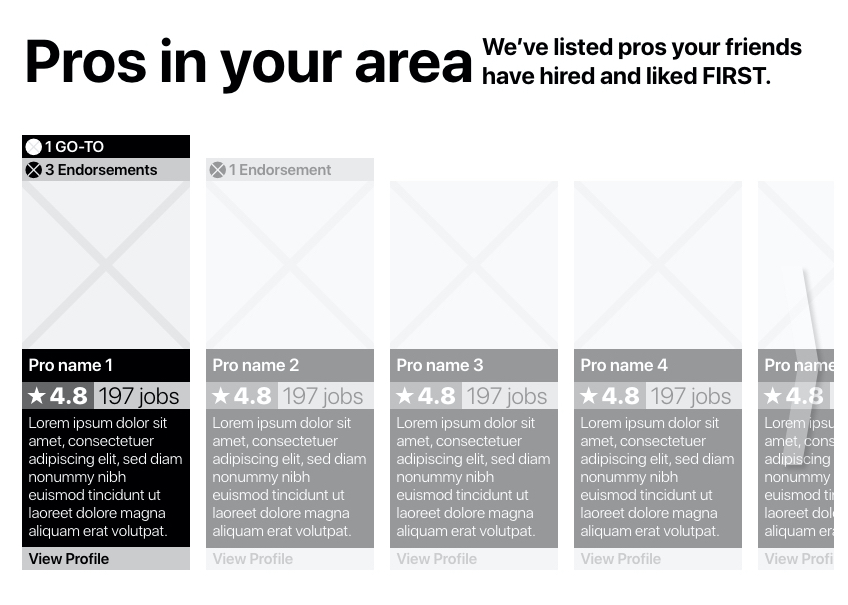
Overall users felt our prototype was clean, easy to use, and straightforward. They found it was not too overwhelming even though it presented a lot of information.

We also got a lot of positive feedback on our concept, validating it further.

Further Development

Along with positive feedback on the interface design, we received some feedback to iterate on further if we had the chance to continue working on the project.

  • Build out the onboarding process

    Users found the interface easy to understand but they had more questions about the concept that weren’t made clear at the beginning of their experience.

  • Poor labeling

    There was some confusion in the labeling, both by the visual treatment of the labels and the wording of them.

Future Recommendations

After evaluating our MVP, we noted areas of opportunity for the platform as it develops further in the future.

  • More functionality

    In order to compete with users’ expectations of an e-commerce experience, we would suggest building out the payment process on the site as well as adding comparison tools for the search process.

  • More educational content

    To inform user even further, the platform could have an additional educational segment of the platform, similar to e-learning platforms. This can be integrated with our informational chat feature.

High-fidelity Wireframes

I developed our concept further by designing high-fidelity wireframes. I chose a green color scheme to match the fresh and lively mood of "bio" (meaning life) used in the name of the platform. The styling of the cards and buttons are meant to look modern and trendy but still have a professional and serious feel.

Click here to see these wireframes in higher resolution.

Personal Reflection

This project brought up many challenges for me in terms of designing an MVP. With a limited amount of time and a broad problem statement to design for, it was hard for us to narrow our focus accordingly. I think in order to help us narrow our scope, we needed to be more disciplined in defining a more specific problem to solve for. With that narrower scope, we could better prioritize features for our concept. I’d like to get better at recognizing what to prioritize within tight time constraints.

We also ran into problems with our usability testing and creating tasks well to get the most accurate feedback. This is something I know I need to practice more. I want to be able to write tasks that won't lead the user too much but that's still clear and easy to understand.